05/19/2025 | Unsubscribe |
Mission: Ultimate Alerts was designed for active and passive US investors to notify you about short-term and long-term risks and opportunities. Our mission is to provide you with an objective and historically accurate understanding of financial markets, macroeconomics and how it all affects your saving and investing. |
|
|
Good Morning! |
Here are some important charts and ideas capturing the latest trends in US markets to help you understand what is happening from multiple different perspectives: |
 | Mohamed A. El-Erian @elerianm |  |
| |
One of the most striking things about the high US budget deficits of recent years is that they occurred in the context of historically low unemployment rates (around 4%).
Adapting one of John F. Kennedy's famous quotes, its better to fix the fiscal holes when the sun is shining | | 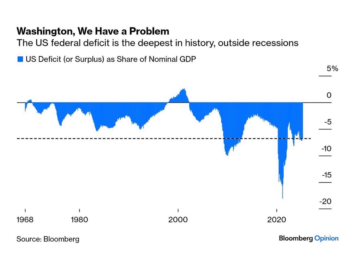 | | | 2:06 PM • May 15, 2025 | | | | | | 380 Likes 109 Retweets | 41 Replies |
|
|
📊 What the Chart Shows |
The chart illustrates the US federal budget deficit (or surplus) as a share of nominal GDP from the 1960s to 2024: |
The US is currently running one of the deepest budget deficits in history, outside of recessions The deficit is hovering around –7% of GDP, a level previously associated with economic crises or wartime spending Historical context: Most severe deficit spikes in the past (e.g., early 1980s, 2008 financial crisis, 2020 COVID crash) were recession-driven
|
💼 What This Could Mean for You |
⚠️ Less Room for Stimulus:
In the event of a future slowdown or crisis, the government may have limited fiscal capacity to respond. 🏛️ Policy Pressure:
Sustained large deficits could trigger future tax reforms, entitlement debates, or spending cuts. 📉 Long-Term Bond Impact:
Elevated deficits can put upward pressure on interest rates if investors demand higher yields to fund government borrowing.
|
🔁 Alternative Perspectives to Consider |
💡 Deficits Not Always Bad:
In a low-rate world with global demand for Treasuries, some argue that high deficits are manageable if they support growth. ⏳ Lagging Fiscal Repair:
Political gridlock may delay adjustments, but high nominal growth could gradually shrink the deficit ratio. 📊 Debt vs. Deficit:
A large deficit today doesn't always mean unsustainable debt if nominal GDP continues to grow faster than interest costs.
|
 | Markets & Mayhem @Mayhem4Markets | |
| |
Mega-cap growth and tech positioning remains well below its median level, per Deutsche Bank | |  | | | 12:41 PM • May 12, 2025 | | | | | | 17 Likes 4 Retweets | 9 Replies |
|
|
📊 What the Chart Shows |
The chart displays weighted average z-scores of indicators tracking Mega-Cap Growth (MCG) and Tech positioning from Dec 2009 to the present: |
Current percentile: 14% — positioning is more cautious than usual, with only 14% of historical readings being lower Latest high-frequency reading (orange dot): Well below the median and approaching 1 standard deviation Investor stance: Significantly underweight vs. historical norms, suggesting reduced exposure to mega-cap growth and tech stocks
|
💼 What This Could Mean for You |
📉 Room for Rebound:
Low positioning can set the stage for a reversal if sentiment shifts or fundamentals improve. 🧭 Contrarian Opportunity:
Underweight positioning may present a tactical buy-the-dip opportunity for longer-term investors in tech/growth sectors. 🚧 Risk-Off Sentiment:
Current underexposure signals caution among institutional investors, possibly tied to macro uncertainty or valuation concerns.
|
🔁 Alternative Perspectives to Consider |
⏳ Still Early in De-risking:
Positioning could drop further if macro conditions worsen or rates stay higher for longer. 💡 Rotation in Play:
Capital may be moving into defensive or value sectors, not necessarily out of equities entirely. 🔁 Positioning ≠ Price:
Stocks can stay elevated or fall further, regardless of investor positioning — other drivers like earnings and policy matter too.
|
 | Neil Sethi @neilksethi | |
| |
Who will be right? BoA hedge fund clients around record low (to 2008) 4-wk net buying flows. Institutions also have been big sellers, while retail at record highs. | |  | | | 3:59 PM • May 6, 2025 | | | | | | 516 Likes 153 Retweets | 39 Replies |
|
|
📊 What the Chart Shows |
This Bank of America Global Research chart tracks 4-week average net buying flows (in $ millions) by client type: |
Exhibit 28 – Hedge Funds:
Net buying flows have been consistently negative since December 2024, hitting record levels (dating back to the 2008 financial crisis) Exhibit 29 – Institutional Clients:
Selling pressure has also been strong, with flows turning negative since Jan 2025 Exhibit 30 – Private Clients (Retail):
In contrast, retail flows have remained consistently positive since December 2024, reaching record highs
|
💼 What This Could Mean for You |
🧭 Divergence in Sentiment:
Institutional and hedge fund clients are pulling back, while retail investors are still buying — a clear sentiment split. 🧠 Contrarian Signal Potential:
Historically, heavy institutional or hedge fund selling paired with strong retail buying has preceded turning points, but timing remains uncertain. 💡 Retail-Driven Momentum:
Positive retail flows could sustain short-term market momentum, especially in high-beta or speculative names.
|
🔁 Alternative Perspectives to Consider |
📉 Smart Money Skepticism:
Hedge fund and institutional selling may reflect deeper concerns about macro, earnings, or valuations. 🧯 Retail Buying Risk:
Retail flows may be driven by momentum or optimism that could unwind quickly if market conditions change. 📊 Lagging Flows:
These metrics are rolling averages — actual positioning shifts may have already occurred or reversed post-publication.
|
 | Subu Trade @SubuTrade | |
| |
Can we get a pullback? More than 24% of NASDAQ 100 stocks are overbought (RSI above 70). Since COVID, that's led to a 1 week pullback ⬇️ | | 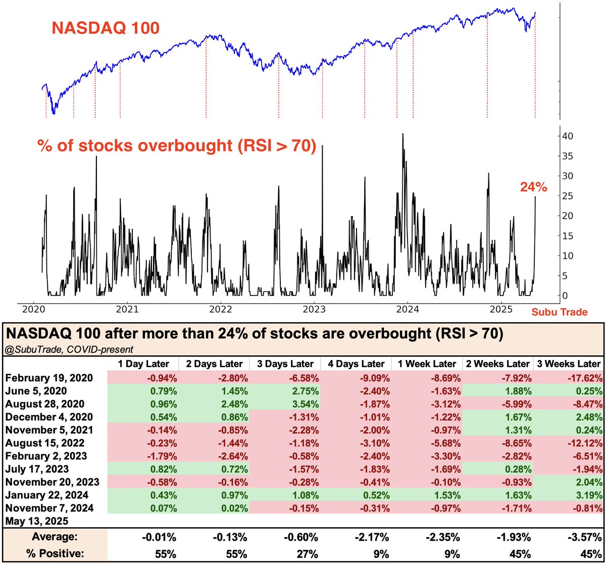 | | | 5:36 PM • May 14, 2025 | | | | | | 631 Likes 131 Retweets | 39 Replies |
|
|
📊 What the Chart Shows |
This chart and data table show the NASDAQ 100 performance following instances when more than 24% of its stocks become overbought (RSI > 70) — a technical indicator suggesting short-term overheating: |
Current reading: 24% of NASDAQ 100 stocks are overbought (as of May 13, 2025) Historical performance since 2020 (COVID era): 3-week average return: –3.57% 1-week average return: –2.35% Only 9% of instances saw a gain 1 week later Recent analogues (e.g., Nov 2023, Jan 2024, Feb 2023) show a negative trend after similar RSI setups
|
💼 What This Could Mean for You |
📉 Short-Term Caution Warranted:
Historically, such high RSI clusters have been followed by short-term pullbacks in the NASDAQ 100. ⏳ Reversion Risk:
Momentum can reverse quickly — traders might consider tightening stops or hedging gains. 🔁 Good for Rotational Strategies:
May favor rotation into sectors less stretched or even inverse NASDAQ exposure for a tactical trade.
|
🔁 Alternative Perspectives to Consider |
🟢 Not Always Bearish:
55% of instances saw positive returns just 1–2 days later — pullbacks weren't immediate or guaranteed. 🔄 Macro Context Matters:
This signal may not override bullish macro or earnings momentum in some cycles. 📊 Only 12 Data Points:
The dataset is limited (COVID era), which reduces statistical reliability and might reflect unusual market regimes.
|
 | Michael A. Arouet @MichaelAArouet | |
| |
Current gold rally put in perspective Chart @topdowncharts | | 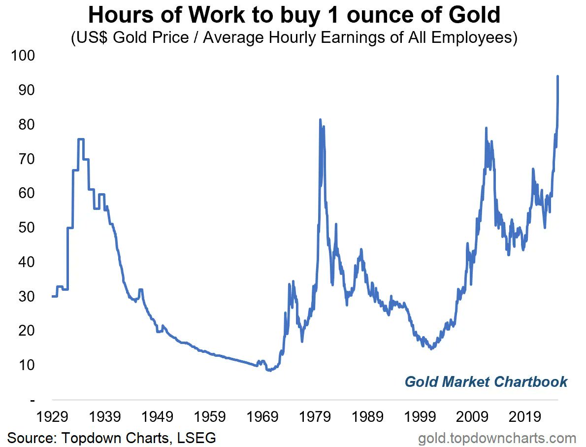 | | | 7:40 PM • Apr 21, 2025 | | | | | | 725 Likes 165 Retweets | 58 Replies |
|
|
📊 What the Chart Shows |
The chart displays how many hours of work (based on average hourly earnings) are needed to purchase 1 ounce of gold, a measure of gold affordability over time: |
As of now, it takes the most hours since at least 1929 to buy 1 ounce of gold The metric reflects both rising gold prices and wage dynamics Comparable spikes occurred in the early 1930s, early 1980s, and 2011, typically during economic stress, inflation fears, or market uncertainty
|
💼. What This Could Mean for You |
🥇 Gold is Expensive vs. Wages:
Relative to income, gold is historically expensive, potentially a signal of overvaluation or macro stress. 📉 Reduced Affordability:
For retail investors or wage earners, this could deter physical gold buying. 🛡️ Flight to Safety:
May reflect strong demand for gold as a hedge, signaling market anxiety, currency debasement fears, or geopolitical hedging.
|
🔁 Alternative Perspectives to Consider |
🔄 Earnings May Catch Up:
If wage growth rises, this ratio could normalize even if gold prices stay elevated. 📈 Momentum & Macro Tailwinds:
Rising central bank buying, geopolitical risk, or de-dollarization may continue driving gold demand. 🟠 Not a Short-Term Timing Tool:
While elevated, this metric alone doesn't predict near-term price reversals — gold often overshoots in late-cycle environments.
|
That's it for today! |
Please reply to this email if today's newsletter helped you in any way. Your feedback is super important to us to continue improving the quality and depth of the information that you receive. |
|
|
📌 Did we land in your inbox? Please make sure our emails arrive in your inbox where you can see them immediately. |
|
Best Regards, |
Ultimate Alerts Team |
|
Disclaimer |
The content distributed by UltimateAlerts.com is for general informational and entertainment purposes only and should not be construed as financial advice. You agree that any decision you make will be based upon an independent investigation by a certified professional. Stocks/Assets featured in this newsletter may be owned by owners/operators of this website, which could impact our ability to remain unbiased. If you click on an affiliate link the website owner may receive compensation. Although we have sent you this email, UltimateAlerts.com does NOT specifically endorse this product nor is it responsible for the content of this advertisement. Please read and accept full disclaimer and privacy policy before reading any of our content: www.ultimatealerts.com/c/disclaimer/ and www.ultimatealerts.com/c/privacy-policy |

Post a Comment
Post a Comment